App Design
Open House
Role
Art Direction
__
UI/UX Design
::
Context
L'Union des Producteurs Agricoles Event
The Portes ouvertes sur les fermes du Québec takes place every September, with over 100 farmers across the province opening their doors to welcome those eager to learn more about farming. It's a popular family activity with a high attendance rate. We therefore decided to create an app alongside the website to streamline the user experience.
::
Thinking
Family Event
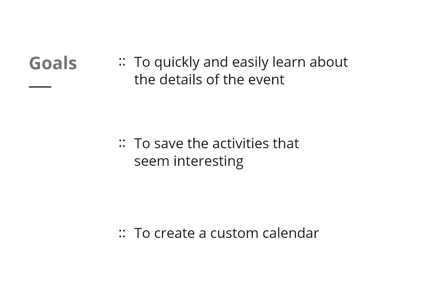
Bearing in mind that the target audience are young parents who want to attend the event with their children, we designed the app to be as straight to the point as possible. After all, these parents have no time to waste. We first created a prototype to test the most important categories we wanted to feature on the app.

Personas

Julie and Patrick are parents to Coralie and Benjamin. The parents work full time and they don’t have much free time between Coralie’s ballet classes and Benjamin’s soccer practice. On weekends, they enjoy outdoor activities that keep the kids active.
Julie
35 years old - Teacher
Tech savvy
0%
Social media presence
0%
Use of mobile device
0%
Patrick
37 years old - Mechanic
Tech savvy
0%
Social media presence
0%
Use of mobile device
0%


::
Solution
Bespoke & Interactive
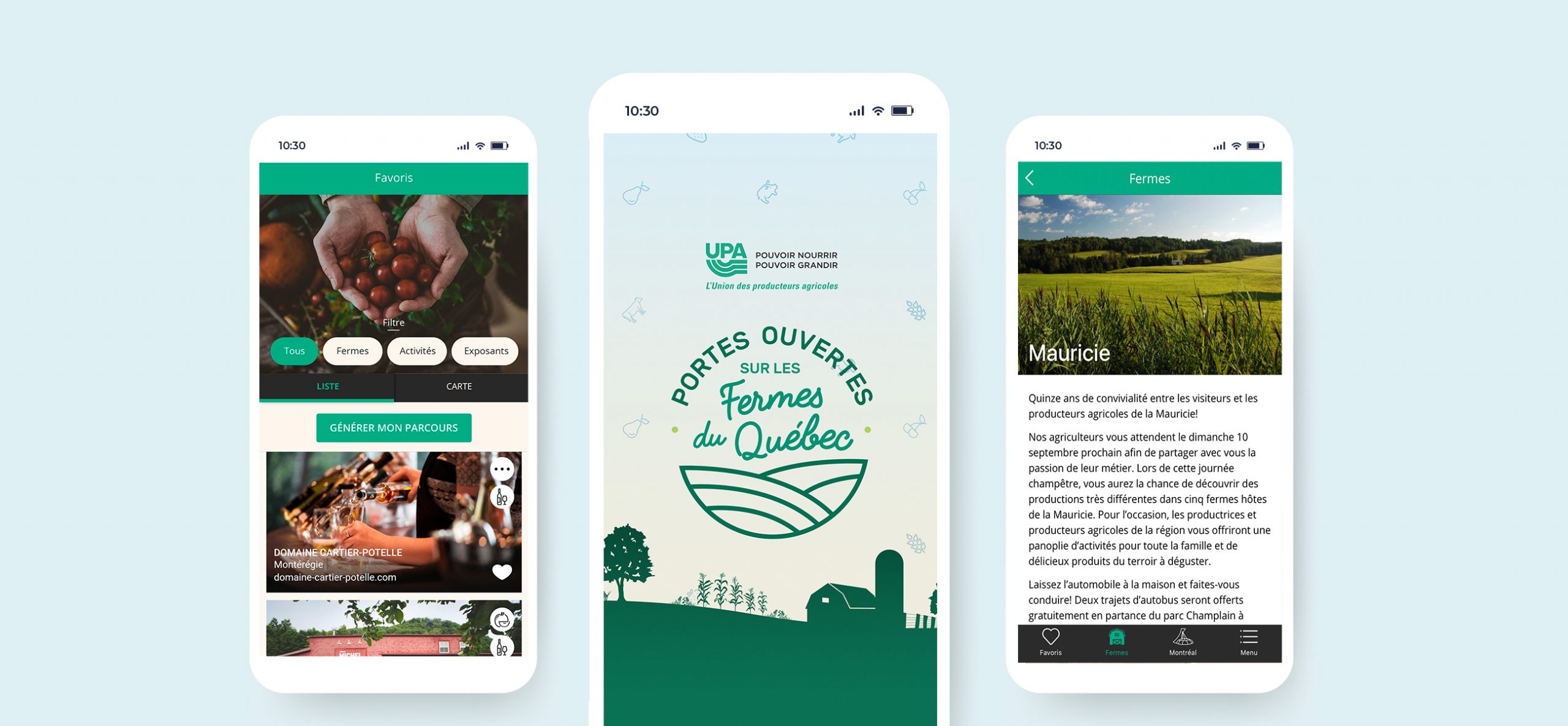
The app was designed with a timeless structure, making any small future updates easy to upload. The main tabs are focused on 2 types of activities: the farms taking part in the event and activities taking place at the Olympic Stadium in Montreal. We also added a "Favourites" tab where the user can save what is of interest to them. This creates a more custom and interactive experience. Thanks to the straightforward design, clients can easily enter information to find what they're looking for and discover the over 100 participating farms and activities available. The mission was to design pages that are structured, clear and simple.

The event takes place outdoors so we opted for a warm and friendly design emphasizing green and turquoise. We also relied on beautiful photos of farms and animals to give the users a sneak peek of what was waiting for them. Moreover, we added simple icons associated with the type of farming production to visually represent the type of farm and its activities.
Agency: Pénéga
Creative Director: Nathalie Marquis
Web Developer: Alexandre Léveillé
Project Manager: Simon Croisetière

