

Identity
Portes Ouvertes
Role
Art Direction
__
Graphic Design
__
UI/UX Design
::
Context
Family Fun
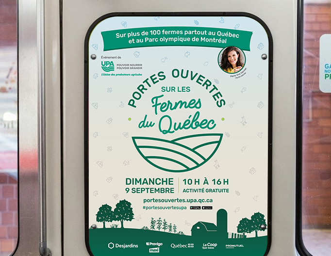
Union des producteurs agricoles is an organization that protects the interests of farmers in Quebec. They make sure that the farmers have the best conditions and they promote local products to the general public. The event Portes ouvertes sur les fermes du Québec is a family event that occurs every year, where farms allow people to visit their installations.
_____ MOOD
::
Thinking & Solution
The Roots
Because soil is at the root of the event, the choice to integrate farm imagery within the identity was an easy yet strategic one. The lines are organic, geometric and slightly abstract. The typography mixes a friendly script font to show the warmth of the family-oriented event and a modern sans serif typeface, for a timeless look. The colours are derived from the UPA logo to keep a familiar look and feel.

::
Website
A Better Experience
The website was redesigned to provide a more streamlined, enhanced user experience. The pages were restructured, offering users a more personalized journey and easier access to information. The website was designed to be linked to the app so that both platforms are always in sync.
Being able to save a list of the places the user wants to visit is a new feature that wasn't available in previous years. The user can then email the list to themselves without creating an account. This makes it quick and simple for themselves to plan their day.
Another new feature is the possibility to leave a comment about the event. This allows people who are less familiar with the Portes ouvertes event to learn first hand from actual visitors. It's a great way to promote the event for the years ahead while encouraging users to go back to the website.